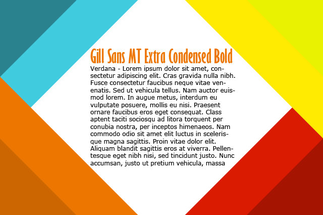
1) Pick the right fonts. Don’t use a novelty font for your body content. Those are best used sparingly for decoration like in a header. Choose a standard font and use a reasonable size. Too large fonts can be as difficult to read as too small fonts; somewhere between 10 and 14 pixels works best. Use a font color that isn’t distracting for your body text. You want your readers to be focused on what the body text is saying, not how it looks.
2) Make your blog snap-judgment friendly. Your header shouldn’t take up more than 1/3 of what’s visible on your screen before scrolling so readers can immediately see part of your most recent post. If you blog title doesn’t explicitly convey what your blog is about, your header is a good place to do it. Use pictures or a subtitle to show what your blog focuses on.
3) Color coordinate with your projects. A craft blog is meant to show off your craft skills so your blog’s color scheme shouldn’t compete with your work. Pick a neutral background that won’t distract from your photos. When choosing colors for your layout, pick ones that work with the colors you most commonly craft with so your blog has a pulled together look. Instead of spending your time trying new colors on your blog layout, do your experimenting in a photo editing program by making palettes like the one above. When you find the perfect combination, make the changes to your blog. Don’t forget to save your color palette so you’ll have a handy reference to use when you need to design things that coordinate with your blog like ads or banners.
4) Be sure that your blog works on more than just your favorite browser with your favorite settings. Try multiple browsers and compare your blog’s dimensions to standard display resolutions for computer monitors. Making your blog 1024 pixels wide is a safe bet, though wider resolutions are more common. This is a great time to hit up your friends for help. I almost always ask my sister to checkout my blog on her computer after I make changes to it.
5) Minimize the number of clicks readers have to make. People will get frustrated and move on if your blog is too much work. Avoid unnecessary cuts that require readers to click “Read More,” and include, at the very least, 3 posts per page (but more is better) so new visitors can browse more easily. Make sure that your comment system doesn’t force your readers to go through more than 2 pages. This is something to be aware of especially if you’re using Blogger because the wrong combination of settings on Blogger can force a commenter to go through 5 pages in order to leave a comment and get back to the original post.

Leave a Reply